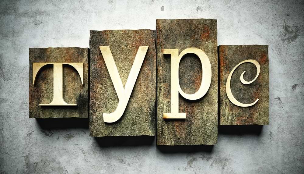
Typography is the process of arranging text on a printed page or digital screen in a visually pleasing way. It should make the text more aesthetically appealing, while not negatively impacting readability or the effectiveness of the message.
Typography matters because it helps conserve the most valuable resource you have as a writer—reader attention.
Typefaces have personality. For example, Comic Sans typeface will make your audience feel very different about your brand than they would if you were to use Baskervville. Just like choosing your brand colors, you should choose typefaces that are going to inspire the desired emotional response in your audience.
The majority of commercial fonts require the purchase of a font license. However, Google has a repository of 1000+ font families which are free to use for commercial and non-commercial projects. In this article we’ll look at how to leverage the Google font library in your website project.
TL;DR Listen to my short video where I demonstrate my method for picking font pairs that work well together and are consistent with my brand tone.
Table of Contents
The vocabulary of typography
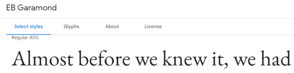
“Typeface” refers to a broad style of text representaton. For example “EB Garamond” is a typeface. Within each typeface there are usually some different style options e.g. “EB Garamond Regular 400“, “EB Garamond Regular 400 Italic“, “EB Garamond Bold 700“, “EB Garamond Extra-bold 800 Italic” and so on. These are typeface variations.
When people ask questions like “what font is that?”, they are really asking “what typeface variation is that?” In practice the terms are used almost interchangeably. Fonts, strictly speaking, are the actual digital files on your computer which render the typeface variations. The word font itself comes from the Middle French “fonte”, meaning “cast in metal”. Centuries ago, printers cast complete sets of metal letters to make up a font. A collection of two or more font files is a “font family”.
Just to confuse matters a little more, some fonts are described as “variable fonts” meaning that one set of digital font files is capable of rendering two or more typeface variations of the same typeface.
Font types and font psychology
There are a vast number of font choices available. The correct font for your website or other design project will depend on your target audience and what kind of outcome you are hoping to achieve.
Serif Fonts – In typography, a serif is a small line or stroke regularly attached to the end of a larger stroke in a letter or symbol within a particular font or family of fonts. Serif fonts are very common in printed materials like books, magazines and newspapers.


Neuton, Cormorant and EB Garamond are all serif fonts.
Some of the emotional associations you can expect from using a serif font in your designs include:
- Trust
- Respect
- Authority
- Formality
Serif fonts are a great fit for more traditional brands and industries.
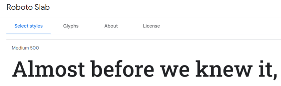
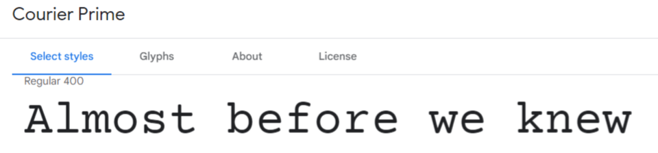
Slab Serif Fonts – Similar to serif fonts except that the extension strokes are usually thick and straight. Slab serif has a more “industrial” feeling. Popular slab serif fonts are Arvo, Courier Prime, and Roboto Slab.
They’re associated most frequently with:
- Confidence
- Solidity
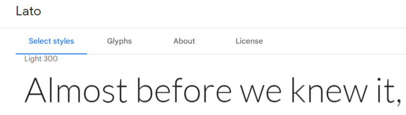
Sans Serif Fonts – The word “sans”, borrowed from French, means “without”. Therefore, “sans serif” refers to fonts which are without the little extension strokes on their characters. In the early days of the internet, it was difficult to render serif fonts cleanly with low resolution monitors, so web designers stuck to sans serif fonts. That tradition has largely continued for mobile and web app user interface designs today.
Open Sans, PT Sans and Lato are popular fonts in this typeface category.
Some of the word associations you can expect from using a sans serif font in your designs include:
- Straightforward
- Modern
- Innovative
- Bold
Script Fonts – These look a lot like cursive writing. Script fonts can add a lot of style and personality but aren’t always the easiest to read.
Rochester, Dancing Script and Stalemate are examples of script fonts.
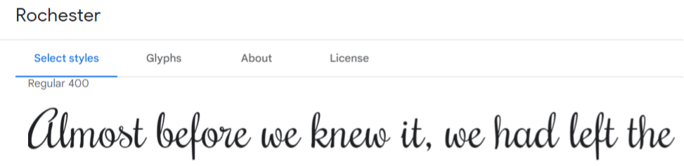
Depending on the font, Script type can also feel fun and whimsical or more traditional and old-fashioned—making script fonts one of the most versatile categories in the design world.
Some of the word associations you might get from using a script font in your designs include:
- Elegant
- Sophisticated
- Traditional
- Creative
- Happy
- Personal
Script fonts can be a fantastic choice for brands focused on providing goods or services for children.
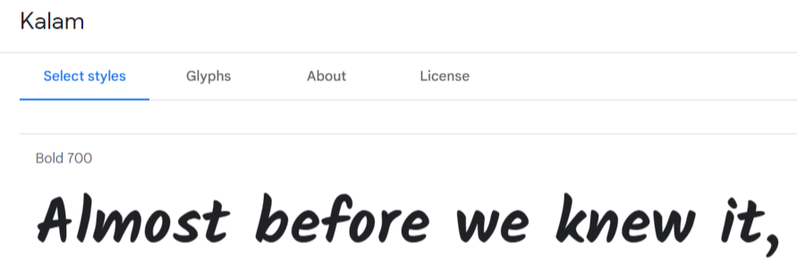
Handwritten Fonts – These are occasionally categorized as script fonts but the difference is that script fonts tend to be more decorative or even have a touch of calligraphy while a handwritten font tends to look more like the penmanship written in a letter.
Kalam, Marck Script and Kristi are all handwritten fonts.
Monospace Fonts – With most fonts, the amount of horizontal space occupied by each letter is proportional to the space of the character itself. But with monospace, as the name suggests, each letter occupies the same amount of horizontal space. The style is reminiscent of the old typewriter printed pages.
Some examples are Courier Prime, PT Mono and Jetbrains Mono
Computer code is often represented in manuals, books and blog posts using monospace font. However, monospace suffers from being less readable than proportional fonts. There is no good reason to use monospace fonts for body text.
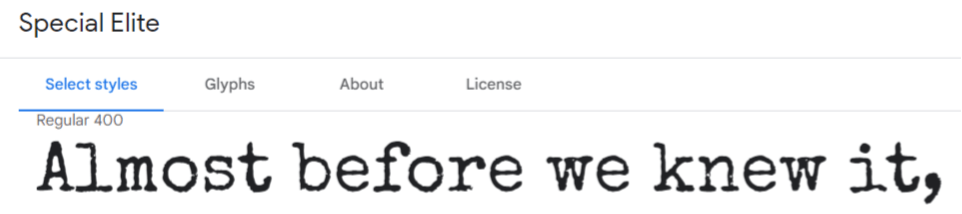
Display Fonts – Used specifically for callouts or other elements intended to attract attention. Not suitable for large blocks of paragraph text.
Lobster, Abril Fatface and Special Elite are some of the display fonts hosted by Google.
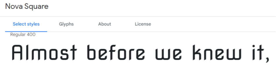
Block Fonts – A sub category of Display fonts that are easy to read and used most commonly in signage, advertisements, brochure headlines, and other graphic designs where large type is necessary.
Examples are Iceland, Quantico and Nova Square.
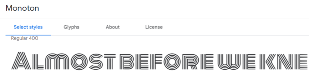
Novelty Fonts – Another sub category of Display fonts. These are great for when you really want to let your imagination run wild.
Some Google hosted novelty fonts are Monoton and BubbleGum Sans
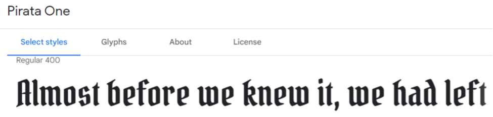
Old English Fonts – No so great for readability but awesome if you need to create a hard core vibe. Sometimes called Gothic script, Fraktur font, Barbarian script, or Blackletter font.
Examples are Pirata One and UnifrakturCook.
Teacherpreneur Marketing
ACADEMY
FACEBOOK GROUP
Eighteen typography tips
Consistency – You should only need two different fonts in your project (three at a stretch). This is because consistency is one of the important core principles of design. Inconsistency slows down the reader, causing them to expend unnecessary mental processing power, and ultimately to lose interest.
Hierarchy – Can users easily discern your headers, sub headers and body text? Limit yourself to three levels of headings. Readers should be able to orient themselves from the headings and easily understand how your content is organized. With more than three levels, that task becomes hopelessly confusing. The best way to emphasize a heading is by putting space above and below, because it’s both subtle and effective.
Contrast – Don’t choose font pairs which are too similar. It’s best if one of them stands out more than the other so they are not competing for attention. Avoid double serif font pairs (serif for body and for header) and double script font pairs.
But Don’t Clash – Choosing compatible font pairs, like matching fine food with an appropriate wine or dessert is a bit of an art form. Fonts which are very different from each other can also cause problems. A sans serif heading with serif body font usually works well, especially if you are trying for a “mature” and authoritative tone.
Single Font Family – It’s always a safe bet to turn one font into two by choosing a different font weight within the same font family. For example Montserrat Light 300 for your body and Montserrat Semi-bold 600 for the headings. The “weight” of a font refers to how “thick” the character lines are.
Constant Scale Factor – A rule of thumb is to scale each level of your text elements by a constant amount. Many designers use 1.618 which is taken from the Fibonacci Sequence and the Golden Ratio. For example, if we start with a body text of 16px (pixels), we can multiply that by 1.618 and round to the nearest whole to number to get 26px for our subheading, then multiply by 1.618 again to get 42px for our heading.
Italics vs Bold Text – Make them mutually exclusive i.e., don’t make something bold and italics (see what I did there?) They should be used to emphasize words or short parts of text, not long stretches.
Color/Weight – Using a different shade of the same color can be a good way of distinguishing your heading from your body text. Also, using your accent color and/or a different font weight on part of your heading can be an effective way to highlight your message.
Tracking – This refers to how much horizontal space is allowed between all characters of a portion of text. Not to be confused with “kerning” which is the horizontal space relationship between two specific characters. Lowercase letters don’t ordinarily need letterspacing. Avoid spreading letters too far apart. If the spaces between letters are large enough to fit more letters, you’ve gone overboard.
Size – To ensure your text is readable, start with setting the font size of your smallest text element (usually the body) and scale your heading and subheadings accordingly. A good minimum size is 16px for the body.
Background Contrast – Use overlays and carefully chosen background colors to make sure there is enough contrast between your text and what is behind it. Use the WebAIM tool to make sure your text meets accessibility standards.
Text shadow – Ensure your type color contrasts with the text shadow effect and the text shadow contrasts with the background. Use hard edges for a modern feel. The harder the shadow, the less offset on the X and Y axis you require. Only use blur over photo backgrounds.
Line separators – Use line dividers and flourish separators to logically organize your content and add a stylistic tone. Pixabay has hundreds of free dividers which you can use. Use sparingly.
White space. Embrace it. – “A lot of mediocre typography results from a perceived need to fill space. If the text looks good, the white space will take care of itself.” – Butterick’s Practical Typography
Alignment – Use left aligned, right aligned or center aligned. Purists may not like center aligned text but it’s often necessary in order to make things look decent on a mobile screen. Never use justified alignment unless you want big ugly gaps between words.
Capitalization – Like italics and bold, it is best used sparingly. Harder to read than lowercase so you should never use it for long blocks of text.
Underlining – Best avoided since it can be confused with text which is hyperlinked.
Bulleted and Numbered Lists – Should always be left aligned so that the bullet points or numbers neatly line up.
Special considerations for ESL audiences
Keep in mind that if your audience consists mostly of non-native English speakers, text readability should be a paramount consideration.
Script fonts and Old English fonts in particular, could be problematic if your readers haven’t had long exposure to the written English language, in all its typographical variations.
It’s safer to choose fonts which are closer to the “standard” typography range for English.
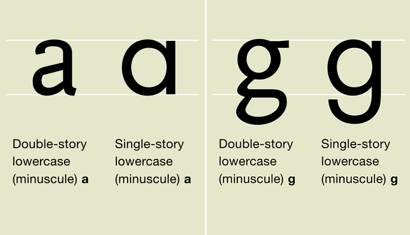
For children, even things like “double story” vs “single story” lowercase characters could be confusing. If you are creating your own lesson materials, be aware that young learners may have never encountered the “double story” variation.
Choosing Google font pairs
As mentioned earlier, choosing compatible font pairs is a bit of an art. Fortunately, there are plenty of Google font pair lists which have been compiled by seasoned design professionals that you can check out.
The Ultimate Collection of Google Font Pairings
Of course you can also browse through the Google font repository until you find something you like and then see which fonts people recommend as a companion (Google search is your best friend!)
When you want to see how your font pairs look together on screen, I highly recommend the Archetype tool. It’s worthwhile to create a (free) account to save your font pair choices to review and compare later.
UPDATE: If you are looking for even more inspiration check out Fonts in Use.
WhatFont Chrome extension
Last but not least, I highly recommend the WhatFont browser extension for Chrome. How many times have you been on a web page and asked yourself, “I wonder what font that is?” With this free tool, it won’t be a mystery any more. You can use WhatFont to reverse engineer typography styles from other websites in your niche.
Listen to my short video where I demonstrate my method for picking font pairs that work well together and are consistent with my brand tone.
Conclusion
Designers and marketers often overlook the power of fonts. When they’re used wisely, fonts can enhance your design and communicate a powerful message in a way that is more cohesive and in tune with your brand. Decide your brand fonts early in the project and use them consistently to create a professional impression.
Above all, remember that your reader’s attention is a valuable and finite resource. Use typography to organize your content logically and minimize comprehension effort for your audience. They’ll appreciate it and your message is more likely to connect.
The author of this post lives in Japan with his wife and family. He has taught English part-time (online and off) for more than a decade. He is passionate about WordPress consulting, online marketing and using the power of the internet to help people achieve their dreams.
He thinks that until you’ve tried sashimi tuna with wasabi, soy sauce, hot sake and a cold beer chaser, you just haven’t lived.