Never assume that new users on your website will know what action you want them to take.
As the owner of the site, you need to provide them with appropriate clues.
If your goal is to get more ESL students to take a trial lesson, you should have a “Book My Class” button.
If your site is there to sell a curriculum program you should have a “Start a Program” button.
If you are offering a downloadable PDF study resource as an email marketing squeeze page offer, your button should say “Send Me the PDF“.
These are your “Call to Action” (CTA) buttons. This is how you move the web pages visitor a little further along their customer journey.
So what makes a good Call to Action?
The following is a list of 16 best practice action points gathered from various conversion experts to make your CTAs more effective. If you follow these CTA button best practices you should get more ESL students into your sales funnel. 🧲
Table of Contents
Simple Action Words
Your CTA should imply some kind of explicit action e.g. “REGISTER FOR MY CLASS” or “JOIN THE GROUP”.
Try to use a word or phrase which completes the sentence:
“I WANT TO _____ “.
Prominent Positioning
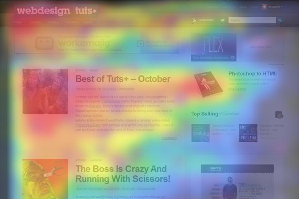
Make sure your most important action button is above the fold i.e. the immediately visible part of your landing page. User eye-tracking studies have confirmed that users of desktop version websites will scan across the top of the page, then down the left side. A heat map of user attention would look like an “F”.
It doesn’t hurt to present your call-to-action a few more times, lower down the page either.
And as anyone who’s ever seen the classic movie Glenngary Glen Ross will know; “ABC – Always Be Closing”. Make sure you have an action button on every page. It is a mortal sin to ever leave a web visitor thinking “what am I supposed to do next?”.
Contrasting Color
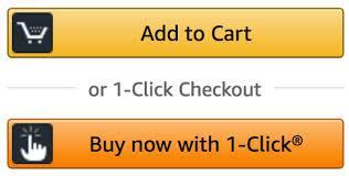
Color psychology has some role to play in your design. Green is a “go ahead” color. Orange is an “action” color. Red in western cultures implies “danger”. All things being equal, it’s a safe bet to follow Amazon’s lead and use orange. After all, they are one company that obsessively tests usability and conversion behavior.
More importantly though, studies suggest that the actual color of the button itself is less important than choosing a color that contrasts to the surrounding elements.
Make Them BIG
Size matters. The user’s eyes are instinctively drawn to the largest elements on the page. If you must use more than one CTA on a page, it is a good idea to make the “primary” action the largest (or at least a more prominent color).

Use White Space
The term “white space” has nothing to do with the color “white” necessarily. It simply means creating adequate empty space around the web page elements you want to highlight so that they are emphasized rather than swamped by surrounding elements.
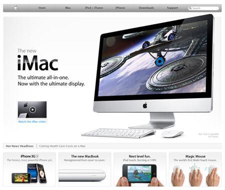
In the Apple IMac example, notice how the “watch the iMac video” call to action is clearly surrounded by empty web page real estate to make it noticeable.
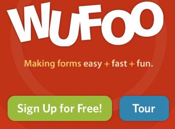
Use a Visual Hierarchy
Users scan from top to bottom, left to right. If you have multiple calls to action on a page, the primary CTA buttons should be above or to the left of the secondary CTAs. In the WuFoo page example, the primary call to action (sign up) is offered before the secondary one (take a tour).
Offer an Alternative
Many users will need to be persuaded of what you are offering before making a commitment. For this type of visitor, offering an alternative call to action that will educate them about your product or services can reduce anxiety. Studies have shown that adding video to your landing page can increase conversion rates by up to 80%. Video is great because a user can passively engage with your site.
Watching a movie is easier than reading a book. Furthermore, if you feature yourself in the video it helps build the all important “trust” factor.
Convey Urgency
Customer procrastination is an even bigger enemy than your strongest competitor. An effective CTA should persuade your visitor to do something “NOW” or “TODAY”. Offering a discount or some other incentive is a good tactic. So is highlighting that availability to your lesson offering may be “LIMITED” or “WHILE PLACES REMAIN”.
Teacherpreneur Marketing
ACADEMY
FACEBOOK GROUP
Reassure Users that Taking Action is Easy
Nobody likes to take actions that are going to be difficult, costly or time-consuming. You should alleviate these concerns. You will get more ESL students to commit if you use “click trigger” phrases like “FREE TRIAL”, “TAKES JUST SECONDS”, “JUST ONE CLICK”.
Make The CTA Specific to Your Offer
If you are offering a free trial lesson, don’t just use a generic button text like “BOOK”. Make it specific to your landing page offer e.g. “BOOK MY TRIAL”. And try to use as few words as possible. Remember the old KISS principle (Keep It Simple Stupid).
Watch marketing legend Neil Patel’s video as he explains this and other tips for optimizing your CTA buttons.
Tell Users What to Expect
One of the internet’s classic frustrations is when you spend time carefully filling out a form only to be directed to another screen requesting something which you can’t or won’t provide (credit card details, usually). Reassure users about what will happen after they click.
Sites which take online payments should spell out their accepted payment methods up front to reduce click fear. If you are using a multi-page form, provide some visual clues to the user about how far through the process they have progressed.
Use Low Commitment Language
Some A/B testing of button language has confirmed “SHOP NOW” has a higher click through rate than “BUY NOW”. The former implies less up front commitment from the user. Similarly, “READ OUR OVERVIEW” yielded a 124% increase in conversion over “START TESTING” in one study. You will have greater success and get more ESL students if you remove any scary language that implies high expense of long commitments.
Give Clues About What Each Button Does
One of the goals of good user experience (UX) design is to make buttons give obvious clues about what they do. These are called “signifiers“.
Showing a file icon or PDF document icon gives the user important hints about what a link does. If a button allows the user to download something, show a down pointing arrow. If it plays a video, show right pointing “play” button. These are all usability conventions that you can leverage in your design without needing to offer too much explanation.
Write Button Copy in the First Person
An A/B testing experiment showed a 90% increase in click through rates when using “START MY FREE TRIAL” vs “START YOUR FREE TRIAL”. Freelancers instructors will get more ESL students to join their email marketing mailing list with “Download My Free Study Guide” rather than “Download Your Free Study Guide”.
Use Sensible Defaults
A study in Europe focused on the question of why the rate of organ donor program participation was dramatically worse in some countries compared to others. Was it due to culture? Religious beliefs? Socio-economic conditions? It turned out that the reason for the huge variation was a simple matter of the design of the driver’s license renewal form! Most countries had a checkbox for the question about organ donor participation. In countries with high participation the user needed to specifically “opt-out”. In countries with low participation the user needed to “opt-in”. It was that simple. So think carefully about what default conditions you set for your visitors and whether the actions you are creating for them will be to “opt-in” or “opt-out”.
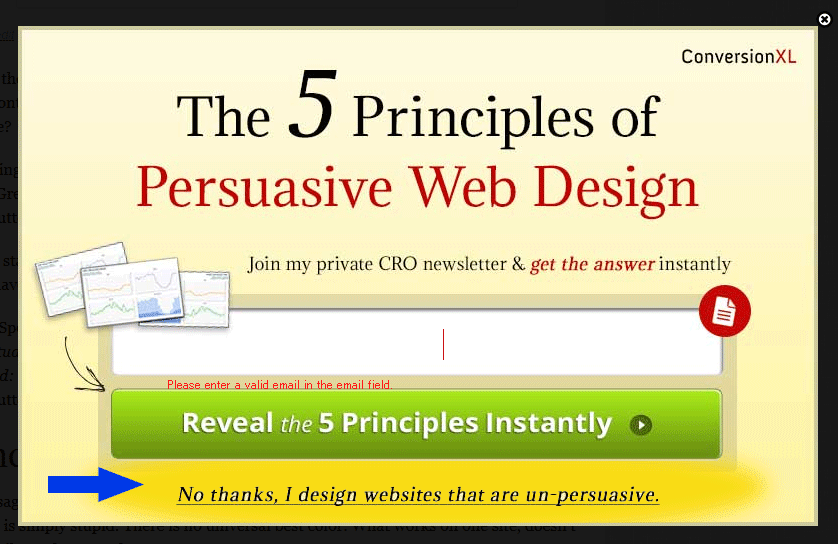
Highlight the Negatives of Opting Out
Sometimes, (depending on your target audience) it pays to highlight the negatives of “opting out” or even “not taking the recommended action”. For example light-box squeeze forms can use this technique to effectively drive newsletter sign ups as ConversionXL have done with using the copy “No thanks, I design websites that are un-persuasive” as their opt-out choice.
Conclusion
Not every Call-To-Action needs to employ all these techniques, but it nevertheless provides a good checklist of best practices to compare against. Providing stronger, clearer calls to action will increase click through, visitor conversions and get more ESL students signing up for your lesson programs. 📈
The author of this post lives in Japan with his wife and family. He has taught English part-time (online and off) for more than a decade. He is passionate about WordPress consulting, online marketing and using the power of the internet to help people achieve their dreams.
He thinks that until you’ve tried sashimi tuna with wasabi, soy sauce, hot sake and a cold beer chaser, you just haven’t lived.